
Problem: learning to use type is hard
Typography is a hard discipline for new designers to learn. I and a lot of designers I know started by aping designs featured on TypewolfI love Typewolf as a source of beautifully curated inspiration. But I also think that on top of taking inspiration from others, we should have the tools to think from scratchand Fonts in Use. While this is a good way to gain good taste for type, you can’t do great and original work without developing a deep and granular understanding of why typefaces work.
But as a beginner, memorizing a large amount of fonts seems like an inefficient way of getting good at typography because:
- It takes too much time and rote memorization.
- The breadth of our type exploration becomes constrained working memory.
- We become over-reliant on popular combinations.
Solution: search fonts from first principles
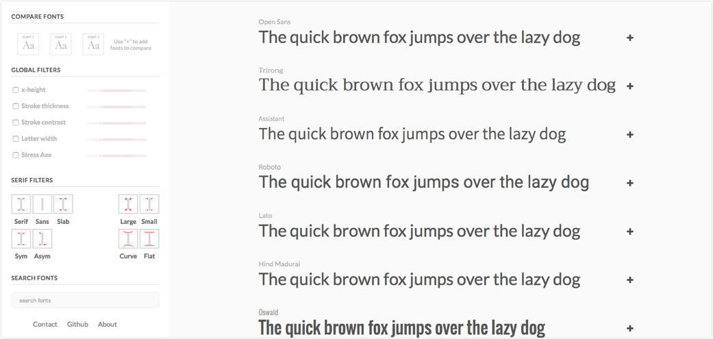
Enter FontSearch, an app that lets users search fonts not by their name, but by their features. Instead of drawing from your memory bank, FontSearch lets you think of the font featuresCurrently: x-height, thickness, contrast, width, stress axe, serif type, serif size, serif symmetry and serif curvature. you want and instantly displays all your options.
Want a body font? Let’s look at fonts with a large x-height, open apertures and low contrast. Want a display font to match? Search for fonts with stronger stroke contrast and lower x-height. But let’s stick with the same double storey “a” and open apertures to tie it together.
To build this app, there were 2 main challenges I needed to overcome:
Make it easy to use for beginners
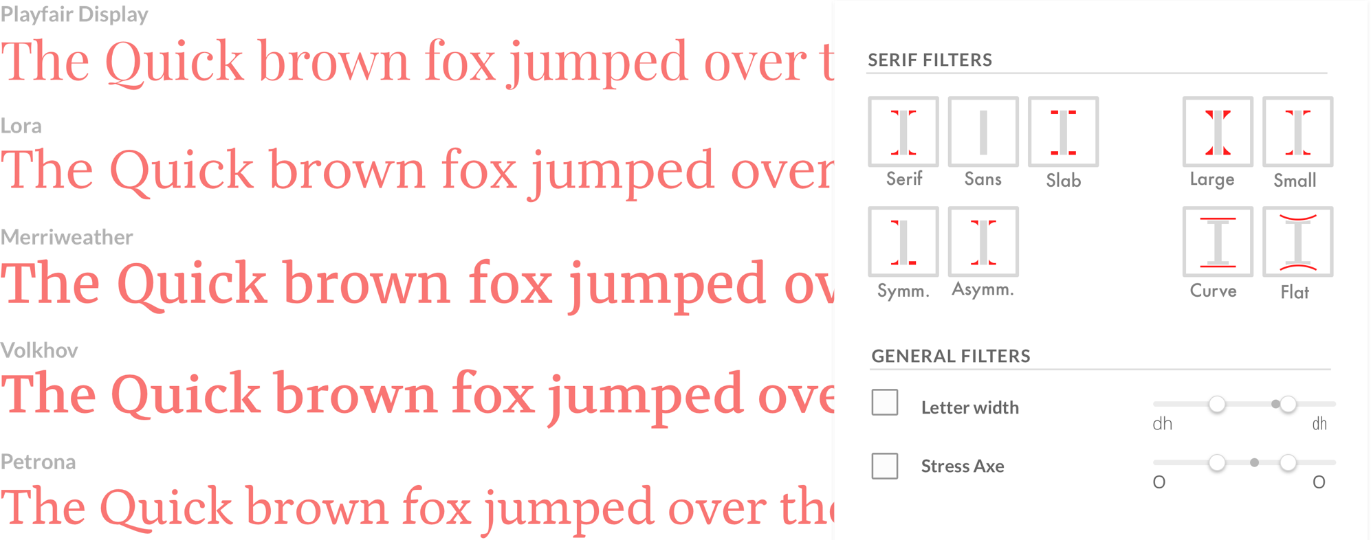
To make the product easy to use for designers who are not familiar with font feature lingo, I developed a set of buttons that visually represented some of the more abstract anatomy terms.

I choose the letter “I” because its simple form makes the serifs more visible. To further increase legibility, I also separated the serifs from the stem of the “I”.
I left the slider filters unillustrated because their names are more self-explanatory. To make font comparison easier, the value of each font saved for comparison will appear as a black dot on the slider.

Cheaply tag all the fonts
Finally, we needed to find a way to tag each font with their features. Originally, we thought about using Mechanical Turk. But according to our estimatesTo get reliable results, we'd have to run through every tag at least three times and take the most popular option., getting reliable data would cost more than $1000 for just the Google Fonts library.
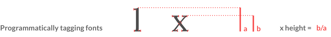
Thankfully, we found a blog post by John Gold outlining the steps he took to programmatically tag typefaces. By converting all the font files into SVGs, it is possible to figure out each feature using vector coordinates. For example: the x-height simply becomes the ratio between the highest point of “l” and the highest point of “x”.
Progress log
There are still many things to improve and build out, but I hope that eventually, I can give other beginners (and maybe even experts!) a better way to approach the amazing art of typography.
See a WIP version of the app here.
See the code on GitHub.
Currently, we’re working on developing the front-end of the website and tagging some basic font features.
In the medium term, we’d like to include more features and build detailed pages for each font that highlight their features.
In the long run, we’d like to integrate licensed fonts from different foundries to make as complete a database as possible.
If you’d like to help, let me know!