It’s been… uh nine months since the last update on this site’s open redesign. Progress is slow, but working this way has been dangerously fun.
Fixing some long overdue issues
Can you believe this site didn’t work on mobile this entire time? I mean, I started the design with almost no layout, relying mostly on basic typography to create hierachy, so I thought the mobile would be usable enough I could come back and update it later. Turns out, I forgot to add <meta name="viewport" content="width=device-width, initial-scale=1.0"> to the head because who knew jekyll would initialize the boilerplate without? Anyway, that’s fixed.
I also apparently forgot is to set up analytics, so for the last few months only the events fired from my hidden archival site were making it through to Google Analytics. That’s fixed too.
Lastly, I cleaned up the date formatting on this site so that it’s always: date + month spelled out + last two letters of year (e.g. 03 mar 21), which I like for being unambiguous for non-US readers. You can also drop the date and it’s still readable.
A quick pass at typography
One cool thing about re-using a font you’ve already purchased is that you can have a font that you like, for free! Yay! But after that it all starts going downhill.
While Colfax’s slightly furistic yet friendly geometry served me well on the Autoflow marketing page, it’s not particularly ergonomic for text-heavy sites. The jump between regular and medium is pretty aggresive. I’ve seen this issue with Graphik too. You can manage by either sticking mostly to regular, or just build that thick medium into your design, which I don’t want to.
For now, I settled on a hacky compromise between the two approaches: using mostly regular, while subtly boosting the weight of my titles like this: h2{-webkit-text-stroke:0.4px; letter-spacing: 0.02rem;} I’m not particularly proud of it, but compared to before, I think this change, paired with some small tweaks to link styles and paragraph spacing will dial back the typographic presence a bit, which will tide me over while I look for a real type solution.
What’s next
My big goal is to land on a good type system for the site. I’m eager to try a serif for the body, play around with some of the weird stuff from Future Fonts, and try to develop a multi-typeface site. But really, I’m just excited to have a reason to read Bethany Heck’s Font Review Journal from front to back.
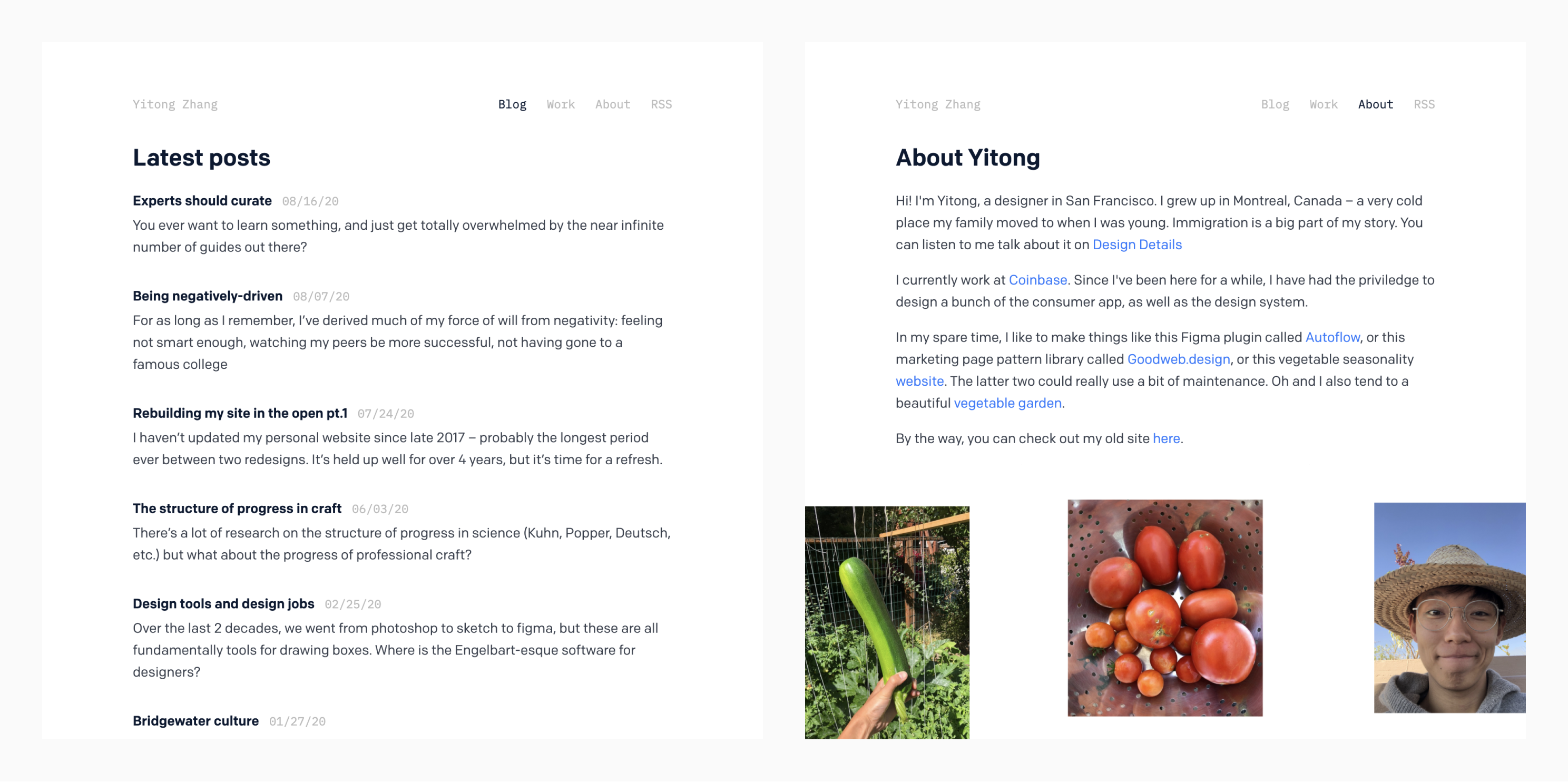
Oh and I think some kind of medium-like image zoom would be nice, now that I have more than one picture in my posts.
Overall, it continues to be fun designing directly in code. I still don’t have a Figma file or a Notion doc. Switching on the fly between blogging, designing, and coding in the same session is giving me a sense of flow that I’ve not experienced at work in a while. Everything feels so dangerously immediate, and I love it.